Archive
Dec30
Another car brand has revealed its new flat logo
Comments Off on Another car brand has revealed its new flat logo

One of the most important rebrands at the end of 2021, which chose the flat design for its logo was that of Swedish car manufacturer Volvo.
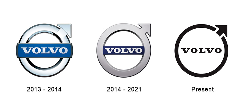
According to Volvo, the new design is a modern reinterpretation of the logo, but retains its own essence. Volvo’s new logo is a simple black, flat design which keeps the same circular shape as both the male symbol and the scientific symbol for iron, first used by the brand in 1927.
Volvo joins other car manufacturers like Toyota, Renault, Kia and others who have decided to switch to flat design with their logos.
It is the only major change of the Volvo logo in the last 7 years.

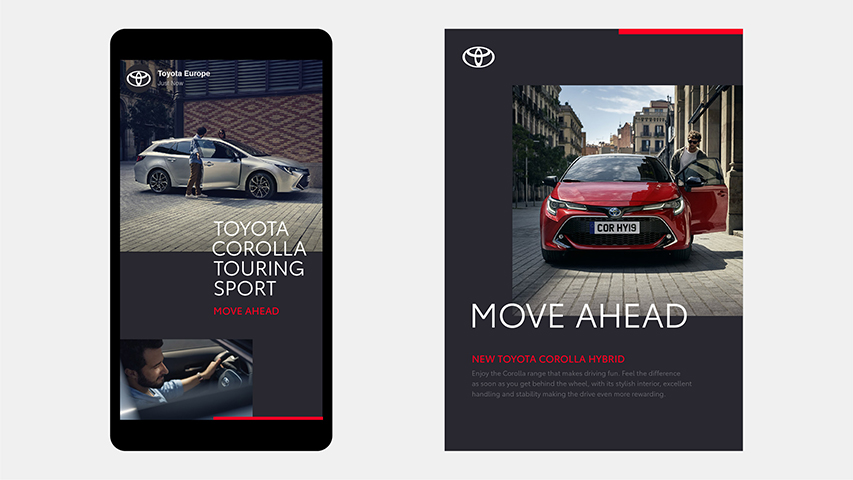
Recently, Toyota has redesigned its logo with a revised visual identity, created by The & Partnership for Toyota’s Europe division. They opting for a flat design includes removing its wordmark.
In fact, Toyota joins other major car brands that have abandoned 3D logos and returned to a 2D, flat design, in the last time.
However, this is not a trend, but rather a need for simplification, according to The & Partnership art chief Dan Beckett, in an interview at Deezen.com
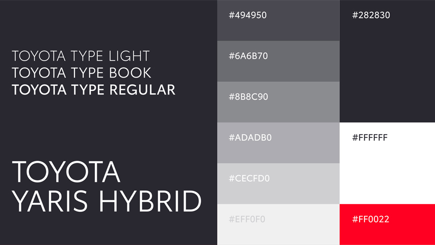
The & Partnership agency has personalized typography, called Toyota type, for both formats: digital and physical, with a monochrome color palette and a red accent.
With the advent of many devices, the new digital age has changed the perspective of design with a much more simplified, minimalist one.
Many other car brands have already redesigned their logo and visual identity to contemporary needs.
Above are just few of them.


Recent comments