Archive for the Design Category

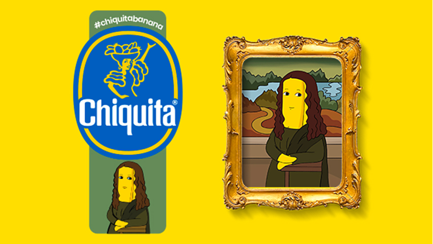
Who hasn’t heard of Chiquita? The most famous banana celebrates art through great 12 female portraits, “made” by famous artists like Leonardo da Vinci, Picasso or Andy Warhol.
Since 1944, when the name Chiquita was introduced, until now the stamp has changed many times, often hosting artistic contributions, such as that of Romero Britto (2018).
The 12 stickers, created by comics artist Mariangela Rinaldi, reinterpreting famous artworks in a personal manner. “Each banana thus becomes a new and fun way to pamper yourself in a moment of excellent taste, both with fruit and art”, she says.
And so, on the Chiquita stickers we find the portrait of Adele Bloch-Chiquita, by Gustav Klimt, The Birth of the Chiquita, by Sandro Botticelli, The Portrait of a Chiquita Banana with a Hat, by Amedeo Modigliani or The Banana L’étoile Chiquita, by Edgar Degas etc.
We invite you to recognize them yourself!

South Korean automotive company KIA Motors has revealed a new logo in a pyrodrone-based fireworks show this month.
Kia Motor’s new logo consists of a brand’s name written in an angular wordmark with connected letters.
“Kia seals its brand promise by developing the new logo to resemble a handwritten signature. The rhythmical, unbroken line of the logo conveys Kia’s commitment to bringing moments of inspiration, while its symmetry demonstrates confidence,” said KIA Motors.
The first version of the logo worked in the period 1994-2012.
The company’s previous logo, as a badge with separated red letters, has updated in 2012.
“Kia’s new logo represents the company’s commitment to becoming an icon for change and innovation”, said Ho Sung Song, Kia’s President and CEO. “The automotive industry is experiencing a period of rapid transformation, and Kia is proactively shaping and adapting to these changes. Our new logo represents our desire to inspire customers as their mobility needs evolve, and for our employees to rise to the challenges we face in a fast-changing industry.”
Kia thus joins other car manufacturers who recently rebrand, like Toyota, Vauxhall, Nissan and BMW which renewed their logos in 2020.

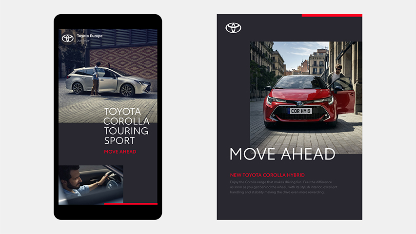
Recently, Toyota has redesigned its logo with a revised visual identity, created by The & Partnership for Toyota’s Europe division. They opting for a flat design includes removing its wordmark.
In fact, Toyota joins other major car brands that have abandoned 3D logos and returned to a 2D, flat design, in the last time.
However, this is not a trend, but rather a need for simplification, according to The & Partnership art chief Dan Beckett, in an interview at Deezen.com
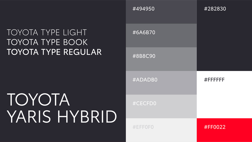
The & Partnership agency has personalized typography, called Toyota type, for both formats: digital and physical, with a monochrome color palette and a red accent.
With the advent of many devices, the new digital age has changed the perspective of design with a much more simplified, minimalist one.
Many other car brands have already redesigned their logo and visual identity to contemporary needs.
Above are just few of them.
Jul25
Abstract: The Art of Design, a new Netflix documentary
Comments Off on Abstract: The Art of Design, a new Netflix documentary

If you don’t saw yet the new free series of creative documentaries made by Netflix, entitled Abstract: The Art of Design, well, maybe now is the time. The whole series contains 8 episodes, but we have choose for now the most important for us: Paula Scher: Graphic Design.
Netflix: „In this episode: Graphic designer Paula Scher paints with words, developing the visual language of iconic brands and institutions around the world.”
Abstract: The Art of Design | Paula Scher: Graphic Design | FULL EPISODE | Netflix


Recent comments