
Archive for the Design Category
Aug16
This Is How an Artist Can Make a Side Gig Profitable
Comments Off on This Is How an Artist Can Make a Side Gig Profitable

A staggering 63 percent of Americans admit to living paycheck to paycheck, so it’s no surprise that approximately one in three of them are working a side hustle to make ends meet. Many of them elect to do so through artistic endeavors, which not only helps pad your bank account, but as Forbes points out, that creative outlet offers the added benefit of boosting your mental and physical well-being.
If you dabble in artistic pursuits as a hobby, it may be time to consider pursuing a side gig. But before stretching a canvas, joining a jam session or throwing clay after your nine-to-five job, make sure you approach a second job the right way so you can ensure that it’s profitable. Vector Logos presents some ideas to help artists, graphic designers, and other creatives get their side gigs off the ground.
Secrets of performance
For starters, you need to figure out what you’re going to offer, whether that’s a service or a product. Some artistic gigs include, but are not limited to, animator, art teacher, graphic designer, makeup artist, industrial designer, fashion designer, motion graphics designer, painter, sculptor, jewelry designer, cake decorator, and illustrator. Getting going is easy these days, thanks to the internet. There are job platforms like Upwork which help you to market talents like graphic design services, where you can connect with clients, frame project details, and set your own freelance graphic design rates.
Do It Your Way
Whichever path you choose, Mic suggests thinking about how you can make your offering different. Before diving into your project, make sure you craft a detailed budget that includes all of your costs — from materials to home office to vehicle if applicable — so you can ensure you’ll actually be turning a profit from your gig.
It’s also crucial that you find a balance between your day job and side gig without feeling burned out or compromising one for the other — remember, for now, you need that nine-to-five job. You can’t risk losing a steady job, especially if you have a family or a pile of debt to pay down. Focus on one job at a time so you’re putting in 100 percent effort. Use a day planner or app to keep track of your schedule, make to-do lists, and set boundaries for both jobs. It’s also important to make time for self-care such as proper rest, exercise, healthy meals (try cooking them ahead and freezing to save time), and social time with friends and family.
The Perfect Creative Environment
Make sure you have the proper home workspace so that your side gig feels like a profitable job, not just a hobby. Choose a distraction-free space that’s either an independent room or at the very least is sectioned off by some form of partition. Find an organizational system that works best for you, but don’t neglect this detail as it’s liable to save you from having a few headaches.
A comfortable place to work will prevent stress on your neck and back, and with the right design you gain the added benefit of raising the value of your home. Since you already have an artistic eye, you should have no problem figuring out ways to decorate your workspace in order to feel inspired and focused while also being aesthetically pleasing.
If all goes well, there may come a time when you can turn your side gig into a full-time business — but just make sure you’re in the right place financially before giving your notice. If this is your goal, save — don’t spend — the profits from your side job so you can put together an emergency fund and support startup costs. This is also a good time to reconfigure your budget (to include all your financial responsibilities) to reflect the fact that you’re no longer generating a second income stream.
Is it time to take your creative talents to the next level? It can be scary to put your abilities out there, but it can also benefit you in important ways. Not only is it a meaningful chance to express yourself, but you can gain a much-needed income boost.
Vector Logos can help you find exclusive, ready-made graphics for your business logo. Check out our different designs today.
Photo Credit: Pexels
Last month, Payoneer, the cross-border payment platform for digital commerce everywhere, had an important visual identity change that “was designed to inspire everyone connected to the brand to strive for a truly universal future for commerce.”
![]()
The new Payoneer logo was designed by Venturethree (V3), to reflects the times has become: diversity and freedom for all in the new global economy.
A spectrum of colors instead one, an infinite circle as its symbol and a typeface that “works in any language”.
“As we enter the public markets and look ahead, our powerful new brand has been designed by v3 to keep driving the business forward while keeping us true to our purpose.”, said Scott Galit, CEO, Payoneer
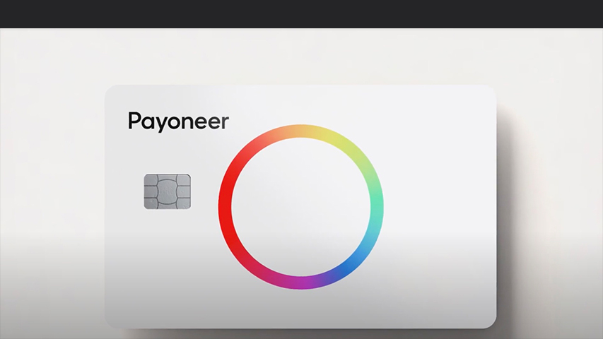
The new bold expression is just the beginning for the new, universal Payoneer – “a brand with the technology, connections and confidence to unlock the boundless potential of billions around the world.”, V3 said.
![]()
Jul10
Renault has revealed their new geometric logo
Comments Off on Renault has revealed their new geometric logo
Renault unveils its ‘Renaulution’ strategy earlier this year, which contains its aims for over the next few years.
The new logo is a minimalist, geometric one and is the most important change of their diamond-shape from 1992 until now.
![]()
Renault’s new logo is reminiscent of its 1972 version, but is more streamlined and optimized for current devices and new media.
Throughout history, the French car manufacturer logo has undergone several major changes since its creation in 1925.

“The diamond shape is a very strong symbol, it hasn’t changed since 1925, so that’s a very strong icon, a recognition element for the brand. This logo is a mix between heritage and projecting the brand into the future. It’s a mix of historical root values for the brand, and holding fresh and new values as well for the future.
…
Now, it made sense to again go back to flat design which is a thing of our times, and yet, give it moment, through the interaction of two diamond shapes, in fact, looping one into the other, to create again movement, interaction, complementarity. So, the flat design approach is very interesting in our digital world, in the way we can manipulate a logo for websites, applications on smartphones or even the screens inside the car”, says Renault’s design director Giles Vidal.
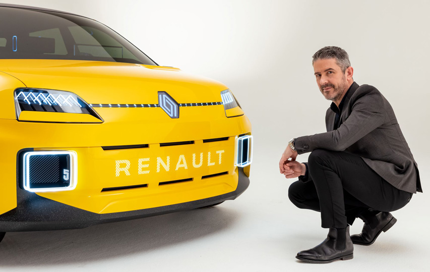
“The Renault 5 Prototype was the first car and expression of this logo”, Vidal says
Jun30
2026 Winter Olympics logo was recently voted
Comments Off on 2026 Winter Olympics logo was recently voted
“Futura” is the name of the logo designed by the Landor Associates brand agency for the Milano Cortina 2026 Olympic and Paralympic Winter Games, hosted in the Italian city of Milan and the Cortina d’Ampezzo ski resort.
The logo has an angular design as a continuous line revealing a two and a six.

“Influenced by the themes of sport, solidarity and sustainability,” said Sari Essayah, the International Olympic Committee’s coordination commission chair for the games.
“Futura illustrates a dynamic and modern design that reflects some of the fundamental values of its Olympic and the Paralympic Winter Games.”
For the first time in the history of Olympic Games, the logo was chosen by a public vote.
Futura, designed by Landor Associates, was chosen with over 500,000 votes out of a total of 870,000 votes came from 169 countries.

The Paralympic Games emblem uses the same design, but with the green, red and blue echoes used to identify the International Paralympics, and also refers to the Aurora Borealis, a rare natural light phenomenon that is seen above the Dolomites mountain, and has the same colorful gradient effect.
“I also love the fact that this emblem reflects the natural wonder of Italy, which is important given the strong legacy of sustainability that is central to these Games”, IPC President Andrew Parsons said.
The design of the two logos was created to have a lower environmental impact in its print and digital mediums, in the same manner as Paris 2024 Olympic logo.
Apr18
Refresh for digital music standard MIDI
Comments Off on Refresh for digital music standard MIDI
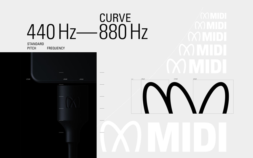
MIDI’s new logo and identity was created as an interaction between visual and sonic, for the next generation of music makers and music lovers, by musician Yuri Suzuki together with graphic designer Sascha Lobe – both Pentagram partners.

„Taking centre stage in the identity, the trademark is inspired by musical forms, such as the Stuttgart pitch, which is an oscilloscope reading of sine waves at a frequency of 440 Hz. The Stuttgart pitch serves as a tuning standard for the musical note of A above middle C, or A4 in scientific pitch notation. A440 has been widely adopted as a reference frequency to calibrate acoustic equipment and to tune various musical instruments.

The wordmark design also references the shape of Lissajous curves, which are graphs of a system of parametric equations used to describe complex harmonic motion. The finalized design represents a modulation shape between 440 Hz – 880 Hz which is globally recognized as a tone for tuning instruments.

The sonic logo complements the wordmark design, creating a mirror between sound and vision. The pitch starts out at 440 Hz and then rises to 880 Hz, with subtle wave shape and stereo modulation. There is an anticipatory feeling to the sonic identity, similar to that of an orchestra tuning to 440 Hz or Strauss’ ‘Also Sprach Zarathustra’. The simplicity and power of these pitches can create a Pavlovian response. Minimal orchestral strings complement the sine waves.” – tells Pentagram.
Since 1981, MIDI is globally recognizable by musicians, DJ’s, producers or educators, and it has radically changed the way electronic musical instruments communicate between them, facilitating the connection of computers and other audio devices.
For more information regarding to MIDI, please check our partners website about “What is MIDI and How to Use It“.
MIDI standards are overseen by the non-profit MIDI Association.


Recent comments