
Archive for the Design Category
May23
3 Best Practices for Small Business Branding
Comments Off on 3 Best Practices for Small Business Branding

There’s a lot of contradictory advice when it comes to branding, but there’s no denying that small businesses need to create a clear-cut, identifiable brand to survive — especially in the online marketplace. Vector Logos invites you to consider the following three best practices when determining the best branding strategy for your company.
-
Determine Your Audience
Reaching your target market may take some trial and error in the beginning. You may already know your demographic, but if you don’t, consider where your customers live, how old they are, and which social media they most frequently use to get a basic sense of what your marketing strategies should be. Choosing a branding strategy will depend heavily on whose attention you are trying to get. Use a demographic mapping tool — or hire a professional to do it for you — for fast analysis of your customers’ metrics.
It’s important that you (or whoever you hire) regularly check these metrics and key performance indicators to analyze how your customers are responding to your marketing tactics and see if they are meeting expectations. If they aren’t, it’s time to pivot and switch strategies. A professional branding marketer can help you if you tire of trying to figure out these details by yourself.
-
Create a Narrative
According to numerous digital marketing experts, the best brands tell a story. Perhaps you’re running a family company that your grandfather founded, or maybe you lost your job and decided to bounce back by turning your hobby into a full-fledged online business. Whatever your background, you’ll see the most connection from customers and likely the best sales results if you connect with your audience by telling them a story.
As you think about what to include in this narrative, let your customers know more about your passions, hopes, and goals for your business. This helps your customers feel a sense of connection to you, which is crucial if the business you own is online-based. Shy away from obvious sales pitches, guilt appeals, or anything that doesn’t feel ethically right to you.
-
Know When to Hire a Pro
While you may be able to build a simple website with a template platform such as WordPress, you may not have the skills (or the time) to create an appealing and functional site and run the site and your social media platforms by yourself. Consider working with a digital marketing agency who can optimize your website, handle SEO, and manage Google and Facebook ads.
When it comes to choosing a logo that represents your brand, try Vector Logos for ready-made options you can easily download and then customize with Adobe Illustrator software. Choose from many expertly designed logos that include your desired font, colors, and design elements.
If you’re new to marketing your business in the digital space, branding can be a tough concept to tackle. Before throwing yourself into the task, take some time to research what you need and reach out to other small business owners to learn how they branded their businesses. Get in touch with professionals with branding experience if you need help with the concept or the practicalities such as web design, logos, and social media engagement. The clearer the concept and the more engaging the narrative, the better identity your company has.
Work with consultant Brad Adams to scale your business and grow your sales and profits! Call (702) 583-6656
Text credit: Elena Stewart
Photo credit: Pexels

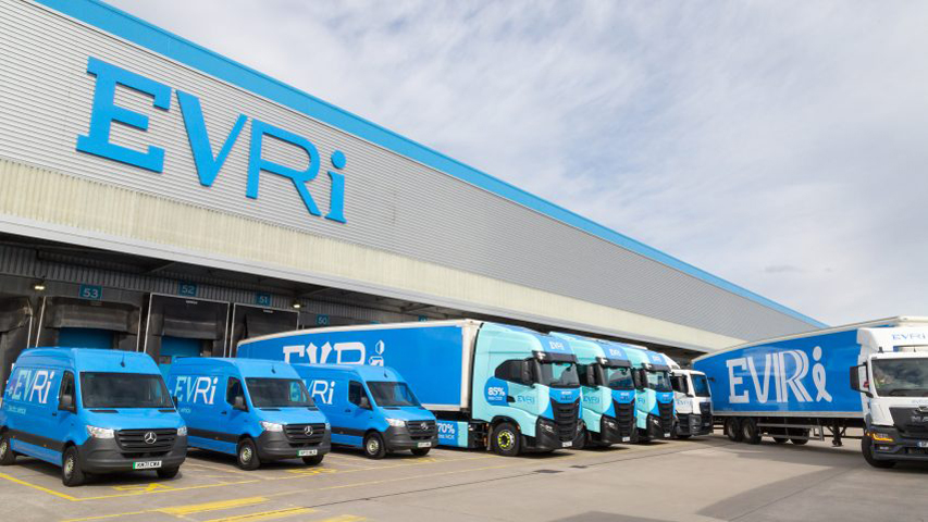
Hermes, the British delivery company, has a new name now: Evri. The new design was created by creative agencies Superunion and Monotype, as a multi-font logo with thousands of variations, in a comprehensive rebrand.
![]()
The new logo typeface was created with many different characters for each of the four letters of Evri, as well as a generative instrument to produce random combinations.

There are a total of 194,481 possible logo combinations – enough for every vehicle in the 5,000 – Evri trucks to have its own logo.

“If they wish to change a letter, for example because it is too expressive or too similar to the letter it sits next to, they can use the tool to choose another alternate. Each character has 20 OpenType alternate glyphs, while each number has four variants and punctuation is confined to a single set.”, said Mark Wood, Superunion senior creative director.
Superunion is a subsidiary of the advertising company WPP and is headquartered in London. The agency has worked also on the branding for Notpla, a company making biodegradable packaging.
Monotype‘s previous works include redesigns for digital era of the the popular font Helvetica and the London Underground’s Johnston typeface.
Dec30
Another car brand has revealed its new flat logo
Comments Off on Another car brand has revealed its new flat logo
One of the most important rebrands at the end of 2021, which chose the flat design for its logo was that of Swedish car manufacturer Volvo.
According to Volvo, the new design is a modern reinterpretation of the logo, but retains its own essence. Volvo’s new logo is a simple black, flat design which keeps the same circular shape as both the male symbol and the scientific symbol for iron, first used by the brand in 1927.
![]()
Volvo joins other car manufacturers like Toyota, Renault, Kia and others who have decided to switch to flat design with their logos.
It is the only major change of the Volvo logo in the last 7 years.
Oct05
20 Free Abstract and Geometric Icons (vol. 1)
Comments Off on 20 Free Abstract and Geometric Icons (vol. 1)
We are very pleased to announce volume 1 of 20 unique abstract and geometric icons offered you by us for free download.
As well, all icons are vector files, respectively .png file without background, ready to be printed on any article or surface.
Here are these 20 icons:
![]()
All these vector icons and symbols are available free to use for any kind of project, personal and / or commercial.
The mock-ups bellow are just a few suggestions to use them.


Enjoy the files:
Sep03
A 3D identity for London Design Festival 2021
Comments Off on A 3D identity for London Design Festival 2021

For the 15th time in a row, Pentagram is creating the identity of the London Design Festival, an event that aims to celebrate and promote London as the world design capital.
This year, Domenic Lippa, Pentagram partner and Creative Director of the festival, focuses around the “form” and launches a bold 3D typographic identity with strong contrasts.

This is the second major event in the field after the pandemic and will take place between 18-26 September 2021, in 10 districts of the London capital: Brompton Design District, Clerkenwell Design District, Islington Design District, King’s Cross Design District, Mayfair Design District, Shoreditch Design Triangle, William Morris Design Line, Design District at Greenwich Peninsula, Park Royal Design District and Southwark South Design District.

With so many locations, the attempt was to create an LDF identity that would work both on physical and digital platforms, but also in different moving environments.


“It’s always collaborative between myself, John Sorrell and Ben Evans. I try to challenge them each year, and they encourage me to surprise them. We collectively know what we want, so the ambition is to constantly reinvent ourselves, but with a recognisable DNA thread linking each year’s campaign with the brand.”, says Domenic Lippa.

The London Design Festival will take place during the period 18-26 September 2021.


Recent comments