Archive

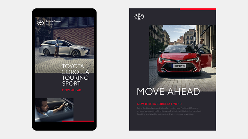
Recently, Toyota has redesigned its logo with a revised visual identity, created by The & Partnership for Toyota’s Europe division. They opting for a flat design includes removing its wordmark.
In fact, Toyota joins other major car brands that have abandoned 3D logos and returned to a 2D, flat design, in the last time.
However, this is not a trend, but rather a need for simplification, according to The & Partnership art chief Dan Beckett, in an interview at Deezen.com
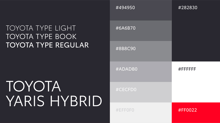
The & Partnership agency has personalized typography, called Toyota type, for both formats: digital and physical, with a monochrome color palette and a red accent.
With the advent of many devices, the new digital age has changed the perspective of design with a much more simplified, minimalist one.
Many other car brands have already redesigned their logo and visual identity to contemporary needs.
Above are just few of them.
Jul25
Abstract: The Art of Design, a new Netflix documentary
Comments Off on Abstract: The Art of Design, a new Netflix documentary

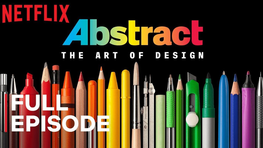
If you don’t saw yet the new free series of creative documentaries made by Netflix, entitled Abstract: The Art of Design, well, maybe now is the time. The whole series contains 8 episodes, but we have choose for now the most important for us: Paula Scher: Graphic Design.
Netflix: „In this episode: Graphic designer Paula Scher paints with words, developing the visual language of iconic brands and institutions around the world.”
Abstract: The Art of Design | Paula Scher: Graphic Design | FULL EPISODE | Netflix


Recent comments