Archive for the Trends Category
Jul25
Abstract: The Art of Design, a new Netflix documentary
Comments Off on Abstract: The Art of Design, a new Netflix documentary

If you don’t saw yet the new free series of creative documentaries made by Netflix, entitled Abstract: The Art of Design, well, maybe now is the time. The whole series contains 8 episodes, but we have choose for now the most important for us: Paula Scher: Graphic Design.
Netflix: „In this episode: Graphic designer Paula Scher paints with words, developing the visual language of iconic brands and institutions around the world.”
Abstract: The Art of Design | Paula Scher: Graphic Design | FULL EPISODE | Netflix
Dec16
Facebook’s new logo design works digitally better
Comments Off on Facebook’s new logo design works digitally better

Probably you already know that Facebook recently introduced its new company branding. They has a new logo to „distinguishing the Facebook company from the Facebook app, which will keep its own branding” So, the new branding uses custom typography and capitalization to create a visual distinction between their company and app.
Even if it is really generic, as someone says, the new logo looks good, in a minimalist manner, and is much more versatile than the previous one. As well, the new logo is more neutral and works better with their apps and services that include: Facebook app, Messenger, Instagram, WhatsApp, Oculus, Workplace, Portal and Calibra.

Since its establishment, Yahoo! pioneered the virtual environment to whose development it contributed by default. Some people only know about the “black period” because of the color. It was in 1994, when the logo did not have an exclamation mark.
Over the time Yahoo! logo has undergone few redesigns until 2019.
Recently, the Sunnyvale-based company has fundamentally changed their visions and adapted their branding to the new demands of the time. They, also, announced a series of new products and features. Pentagram had the mission to exhausting Yahoo!’s philosophy in a contemporary, minimalist, manner, more simplified and according to the new virtual world.
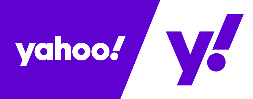
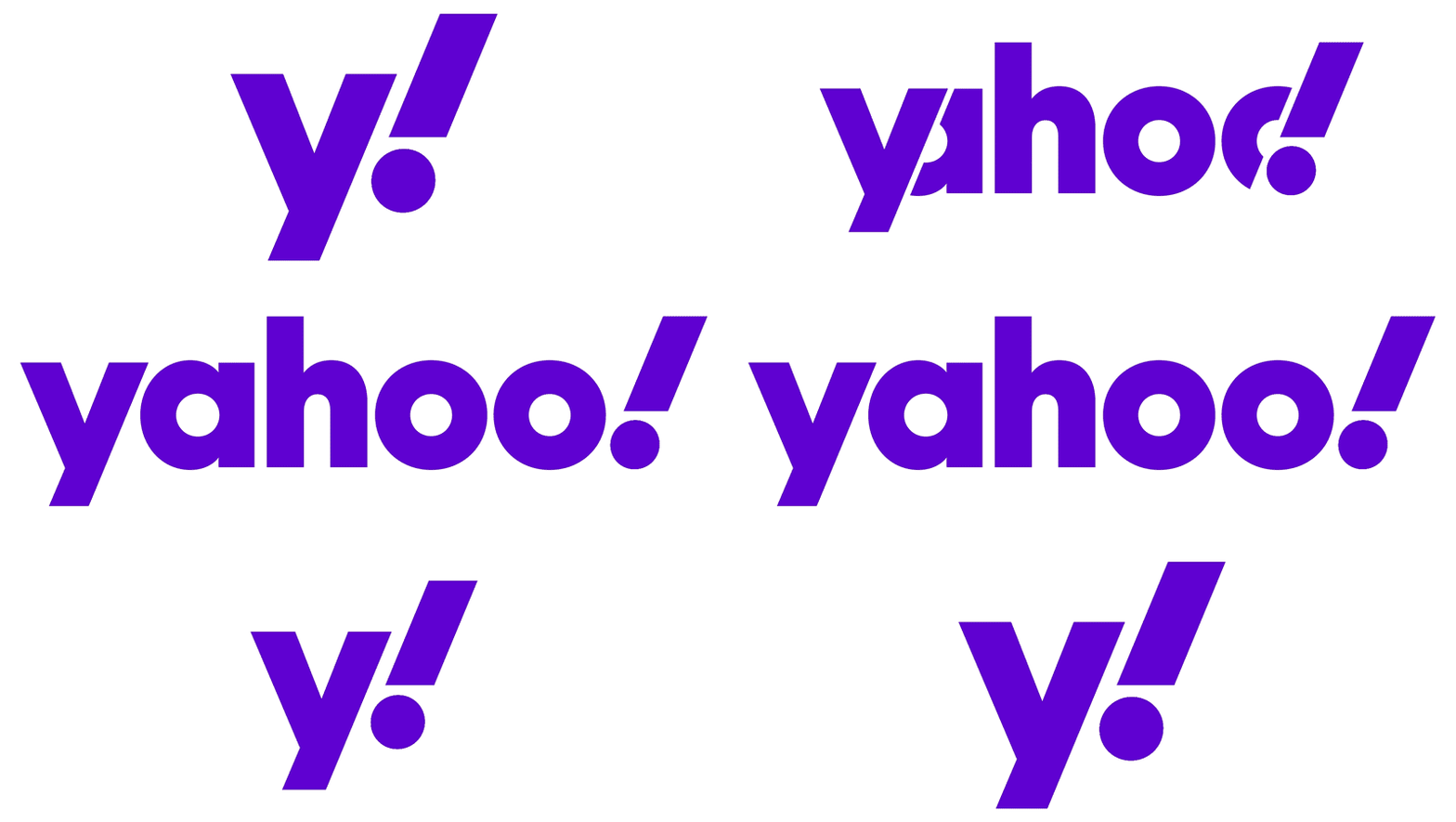
The result – a refreshed wordmark set în Centra No. 2 Extrabold modified such that to be more geometric and compact compared to its predecessor. The exclamation mark was italicized for emphasis. Also, the „y” and „!” are set at an angle of 22.5 degrees (1/16 of a circle) to suggest a sense of momentum and excitement.
The logo has been optimized to work across many platforms and scales, as well on the small canvas of a mobile app. A simple „y!” monogram is used for favicons and social media icons, but, also, with various channels to create sub-brands for Yahoo Finance, Yahoo Sports and Yahoo Weather.
Finally, the color palette of the logo was refined as „grape jelly” for primary purple and „hulk pants” & „malbec” for secondary purples, as well as accent colors.


Recent comments