
Dec30
Another car brand has revealed its new flat logo
Comments Off on Another car brand has revealed its new flat logo
One of the most important rebrands at the end of 2021, which chose the flat design for its logo was that of Swedish car manufacturer Volvo.
According to Volvo, the new design is a modern reinterpretation of the logo, but retains its own essence. Volvo’s new logo is a simple black, flat design which keeps the same circular shape as both the male symbol and the scientific symbol for iron, first used by the brand in 1927.
![]()
Volvo joins other car manufacturers like Toyota, Renault, Kia and others who have decided to switch to flat design with their logos.
It is the only major change of the Volvo logo in the last 7 years.
Oct05
20 Free Abstract and Geometric Icons (vol. 1)
Comments Off on 20 Free Abstract and Geometric Icons (vol. 1)
We are very pleased to announce volume 1 of 20 unique abstract and geometric icons offered you by us for free download.
As well, all icons are vector files, respectively .png file without background, ready to be printed on any article or surface.
Here are these 20 icons:
![]()
All these vector icons and symbols are available free to use for any kind of project, personal and / or commercial.
The mock-ups bellow are just a few suggestions to use them.


Enjoy the files:
Sep03
A 3D identity for London Design Festival 2021
Comments Off on A 3D identity for London Design Festival 2021

For the 15th time in a row, Pentagram is creating the identity of the London Design Festival, an event that aims to celebrate and promote London as the world design capital.
This year, Domenic Lippa, Pentagram partner and Creative Director of the festival, focuses around the “form” and launches a bold 3D typographic identity with strong contrasts.

This is the second major event in the field after the pandemic and will take place between 18-26 September 2021, in 10 districts of the London capital: Brompton Design District, Clerkenwell Design District, Islington Design District, King’s Cross Design District, Mayfair Design District, Shoreditch Design Triangle, William Morris Design Line, Design District at Greenwich Peninsula, Park Royal Design District and Southwark South Design District.

With so many locations, the attempt was to create an LDF identity that would work both on physical and digital platforms, but also in different moving environments.


“It’s always collaborative between myself, John Sorrell and Ben Evans. I try to challenge them each year, and they encourage me to surprise them. We collectively know what we want, so the ambition is to constantly reinvent ourselves, but with a recognisable DNA thread linking each year’s campaign with the brand.”, says Domenic Lippa.

The London Design Festival will take place during the period 18-26 September 2021.
Aug16
This Is How an Artist Can Make a Side Gig Profitable
Comments Off on This Is How an Artist Can Make a Side Gig Profitable

A staggering 63 percent of Americans admit to living paycheck to paycheck, so it’s no surprise that approximately one in three of them are working a side hustle to make ends meet. Many of them elect to do so through artistic endeavors, which not only helps pad your bank account, but as Forbes points out, that creative outlet offers the added benefit of boosting your mental and physical well-being.
If you dabble in artistic pursuits as a hobby, it may be time to consider pursuing a side gig. But before stretching a canvas, joining a jam session or throwing clay after your nine-to-five job, make sure you approach a second job the right way so you can ensure that it’s profitable. Vector Logos presents some ideas to help artists, graphic designers, and other creatives get their side gigs off the ground.
Secrets of performance
For starters, you need to figure out what you’re going to offer, whether that’s a service or a product. Some artistic gigs include, but are not limited to, animator, art teacher, graphic designer, makeup artist, industrial designer, fashion designer, motion graphics designer, painter, sculptor, jewelry designer, cake decorator, and illustrator. Getting going is easy these days, thanks to the internet. There are job platforms like Upwork which help you to market talents like graphic design services, where you can connect with clients, frame project details, and set your own freelance graphic design rates.
Do It Your Way
Whichever path you choose, Mic suggests thinking about how you can make your offering different. Before diving into your project, make sure you craft a detailed budget that includes all of your costs — from materials to home office to vehicle if applicable — so you can ensure you’ll actually be turning a profit from your gig.
It’s also crucial that you find a balance between your day job and side gig without feeling burned out or compromising one for the other — remember, for now, you need that nine-to-five job. You can’t risk losing a steady job, especially if you have a family or a pile of debt to pay down. Focus on one job at a time so you’re putting in 100 percent effort. Use a day planner or app to keep track of your schedule, make to-do lists, and set boundaries for both jobs. It’s also important to make time for self-care such as proper rest, exercise, healthy meals (try cooking them ahead and freezing to save time), and social time with friends and family.
The Perfect Creative Environment
Make sure you have the proper home workspace so that your side gig feels like a profitable job, not just a hobby. Choose a distraction-free space that’s either an independent room or at the very least is sectioned off by some form of partition. Find an organizational system that works best for you, but don’t neglect this detail as it’s liable to save you from having a few headaches.
A comfortable place to work will prevent stress on your neck and back, and with the right design you gain the added benefit of raising the value of your home. Since you already have an artistic eye, you should have no problem figuring out ways to decorate your workspace in order to feel inspired and focused while also being aesthetically pleasing.
If all goes well, there may come a time when you can turn your side gig into a full-time business — but just make sure you’re in the right place financially before giving your notice. If this is your goal, save — don’t spend — the profits from your side job so you can put together an emergency fund and support startup costs. This is also a good time to reconfigure your budget (to include all your financial responsibilities) to reflect the fact that you’re no longer generating a second income stream.
Is it time to take your creative talents to the next level? It can be scary to put your abilities out there, but it can also benefit you in important ways. Not only is it a meaningful chance to express yourself, but you can gain a much-needed income boost.
Vector Logos can help you find exclusive, ready-made graphics for your business logo. Check out our different designs today.
Photo Credit: Pexels
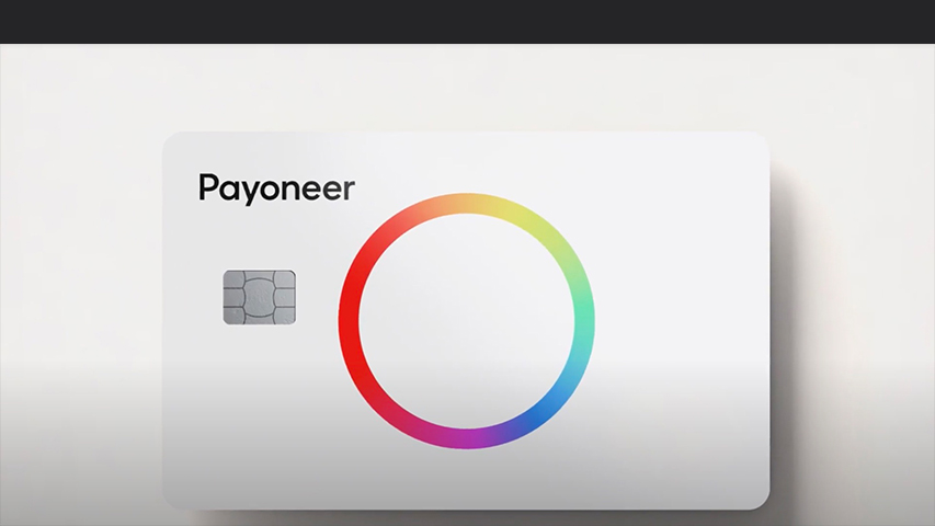
Last month, Payoneer, the cross-border payment platform for digital commerce everywhere, had an important visual identity change that “was designed to inspire everyone connected to the brand to strive for a truly universal future for commerce.”
![]()
The new Payoneer logo was designed by Venturethree (V3), to reflects the times has become: diversity and freedom for all in the new global economy.
A spectrum of colors instead one, an infinite circle as its symbol and a typeface that “works in any language”.
“As we enter the public markets and look ahead, our powerful new brand has been designed by v3 to keep driving the business forward while keeping us true to our purpose.”, said Scott Galit, CEO, Payoneer
The new bold expression is just the beginning for the new, universal Payoneer – “a brand with the technology, connections and confidence to unlock the boundless potential of billions around the world.”, V3 said.
![]()


