
Jul10
Renault has revealed their new geometric logo
Comments Off on Renault has revealed their new geometric logo
Renault unveils its ‘Renaulution’ strategy earlier this year, which contains its aims for over the next few years.
The new logo is a minimalist, geometric one and is the most important change of their diamond-shape from 1992 until now.
![]()
Renault’s new logo is reminiscent of its 1972 version, but is more streamlined and optimized for current devices and new media.
Throughout history, the French car manufacturer logo has undergone several major changes since its creation in 1925.

“The diamond shape is a very strong symbol, it hasn’t changed since 1925, so that’s a very strong icon, a recognition element for the brand. This logo is a mix between heritage and projecting the brand into the future. It’s a mix of historical root values for the brand, and holding fresh and new values as well for the future.
…
Now, it made sense to again go back to flat design which is a thing of our times, and yet, give it moment, through the interaction of two diamond shapes, in fact, looping one into the other, to create again movement, interaction, complementarity. So, the flat design approach is very interesting in our digital world, in the way we can manipulate a logo for websites, applications on smartphones or even the screens inside the car”, says Renault’s design director Giles Vidal.
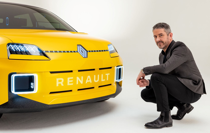
“The Renault 5 Prototype was the first car and expression of this logo”, Vidal says
Jun30
2026 Winter Olympics logo was recently voted
Comments Off on 2026 Winter Olympics logo was recently voted
“Futura” is the name of the logo designed by the Landor Associates brand agency for the Milano Cortina 2026 Olympic and Paralympic Winter Games, hosted in the Italian city of Milan and the Cortina d’Ampezzo ski resort.
The logo has an angular design as a continuous line revealing a two and a six.

“Influenced by the themes of sport, solidarity and sustainability,” said Sari Essayah, the International Olympic Committee’s coordination commission chair for the games.
“Futura illustrates a dynamic and modern design that reflects some of the fundamental values of its Olympic and the Paralympic Winter Games.”
For the first time in the history of Olympic Games, the logo was chosen by a public vote.
Futura, designed by Landor Associates, was chosen with over 500,000 votes out of a total of 870,000 votes came from 169 countries.

The Paralympic Games emblem uses the same design, but with the green, red and blue echoes used to identify the International Paralympics, and also refers to the Aurora Borealis, a rare natural light phenomenon that is seen above the Dolomites mountain, and has the same colorful gradient effect.
“I also love the fact that this emblem reflects the natural wonder of Italy, which is important given the strong legacy of sustainability that is central to these Games”, IPC President Andrew Parsons said.
The design of the two logos was created to have a lower environmental impact in its print and digital mediums, in the same manner as Paris 2024 Olympic logo.
Apr18
Refresh for digital music standard MIDI
Comments Off on Refresh for digital music standard MIDI
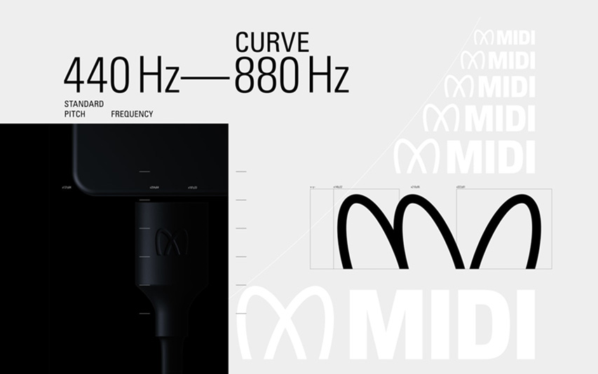
MIDI’s new logo and identity was created as an interaction between visual and sonic, for the next generation of music makers and music lovers, by musician Yuri Suzuki together with graphic designer Sascha Lobe – both Pentagram partners.

„Taking centre stage in the identity, the trademark is inspired by musical forms, such as the Stuttgart pitch, which is an oscilloscope reading of sine waves at a frequency of 440 Hz. The Stuttgart pitch serves as a tuning standard for the musical note of A above middle C, or A4 in scientific pitch notation. A440 has been widely adopted as a reference frequency to calibrate acoustic equipment and to tune various musical instruments.

The wordmark design also references the shape of Lissajous curves, which are graphs of a system of parametric equations used to describe complex harmonic motion. The finalized design represents a modulation shape between 440 Hz – 880 Hz which is globally recognized as a tone for tuning instruments.

The sonic logo complements the wordmark design, creating a mirror between sound and vision. The pitch starts out at 440 Hz and then rises to 880 Hz, with subtle wave shape and stereo modulation. There is an anticipatory feeling to the sonic identity, similar to that of an orchestra tuning to 440 Hz or Strauss’ ‘Also Sprach Zarathustra’. The simplicity and power of these pitches can create a Pavlovian response. Minimal orchestral strings complement the sine waves.” – tells Pentagram.
Since 1981, MIDI is globally recognizable by musicians, DJ’s, producers or educators, and it has radically changed the way electronic musical instruments communicate between them, facilitating the connection of computers and other audio devices.
For more information regarding to MIDI, please check our partners website about “What is MIDI and How to Use It“.
MIDI standards are overseen by the non-profit MIDI Association.

Who hasn’t heard of Chiquita? The most famous banana celebrates art through great 12 female portraits, “made” by famous artists like Leonardo da Vinci, Picasso or Andy Warhol.

Since 1944, when the name Chiquita was introduced, until now the stamp has changed many times, often hosting artistic contributions, such as that of Romero Britto (2018).

The 12 stickers, created by comics artist Mariangela Rinaldi, reinterpreting famous artworks in a personal manner. “Each banana thus becomes a new and fun way to pamper yourself in a moment of excellent taste, both with fruit and art”, she says.

And so, on the Chiquita stickers we find the portrait of Adele Bloch-Chiquita, by Gustav Klimt, The Birth of the Chiquita, by Sandro Botticelli, The Portrait of a Chiquita Banana with a Hat, by Amedeo Modigliani or The Banana L’étoile Chiquita, by Edgar Degas etc.
We invite you to recognize them yourself!


South Korean automotive company KIA Motors has revealed a new logo in a pyrodrone-based fireworks show this month.
Kia Motor’s new logo consists of a brand’s name written in an angular wordmark with connected letters.
“Kia seals its brand promise by developing the new logo to resemble a handwritten signature. The rhythmical, unbroken line of the logo conveys Kia’s commitment to bringing moments of inspiration, while its symmetry demonstrates confidence,” said KIA Motors.
![]()
The first version of the logo worked in the period 1994-2012.
![]()
The company’s previous logo, as a badge with separated red letters, has updated in 2012.
![]()
“Kia’s new logo represents the company’s commitment to becoming an icon for change and innovation”, said Ho Sung Song, Kia’s President and CEO. “The automotive industry is experiencing a period of rapid transformation, and Kia is proactively shaping and adapting to these changes. Our new logo represents our desire to inspire customers as their mobility needs evolve, and for our employees to rise to the challenges we face in a fast-changing industry.”
Kia thus joins other car manufacturers who recently rebrand, like Toyota, Vauxhall, Nissan and BMW which renewed their logos in 2020.


